Ten colour pairs for British homes
Green with pink, brown with blue and eight more pairs to sample beside the furniture you already own. Use them on walls and woodwork, or in fabrics if you cannot paint.
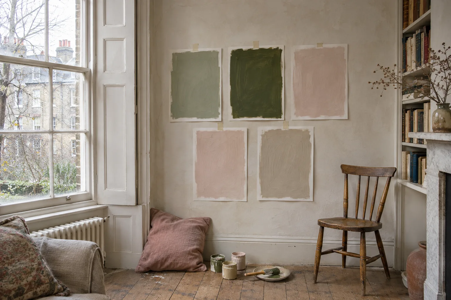
The second colour is where most people stall. It gets easier if you start with something already in the room: the sofa, a rug, the kitchen cupboards. White is a perfectly respectable partner, too. The pairs below are ones we would use in British homes, under British skies, where the light is often grey and the evenings long.
A note on how to read them. These are colour suggestions, not exact matches between brands, and the descriptions are our reading of the colours. Your screen will lie to you about all of them, so treat this as a shortlist for sample pots, not a shopping list. Sample beside your own flooring and furniture, and compare prices for the finish and quantity you actually need.
As a rough guide, not a law, let one colour take most of the room and use the second more sparingly. A cushion or a lampshade is enough to try a partner out before you commit the woodwork.
1. Deep green and plaster pink
The mood is a country house drawing room on a wet afternoon: warm, a little faded, grown-up. We would sample it in a sitting room or dining room, and check that the pink still appeals under the evening lamps. Farrow & Ball Bancha No. 298, a mid-century olive, with Setting Plaster No. 231, a dusty plaster pink. For less money, Lick Green 02 with Lick Pink 08. Pink on the walls, green on the woodwork and a painted bookcase, then a faded rose linen on a chair.
2. Navy and ochre
Confident and slightly nautical, without the stripes. It suits a study, a hall or a kitchen with timber worktops. Little Greene Hicks’ Blue (208), a deep inky blue named after David Hicks, with Yellow-Pink (46), an earthy mustard. Cheaper: Lick Blue 07 and Lick Yellow 07. Navy on the walls or kitchen cupboards; ochre in small doses, such as the inside of a bookcase, a lampshade or a velvet cushion. For more ochre, put it on the walls and keep the navy to the skirting and doors.
3. Chocolate brown and sky blue
The most 1970s pair here, and the one we would most like to see return. Brown grounds the room; the blue stops it going heavy. We would use it in a bedroom or a south-facing sitting room. Edward Bulmer Chocolate with Edward Bulmer Sky Blue. Sky blue on the walls and ceiling, brown on the skirting, doors and a headboard. The reverse, brown walls with a pale blue ceiling, is a lovely trick in a small snug.
4. Oxblood and stone
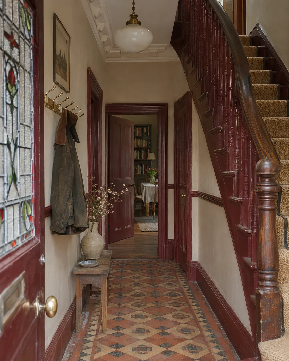
Victorian, and very good in a hall with a tiled floor. It is serious without being gloomy, because the stone does the lifting. Little Greene Bronze Red (15) with Stone-Pale-Warm (34), a honeyed stone. Cheaper: Dulux Heritage Pugin Red with DH Stone. Stone on the walls and oxblood on all the woodwork, including doors and stair spindles. Leave a mahogany handrail as timber.
5. Sage and terracotta
Garden-and-flowerpot colours, and a useful starting point beside timber or cream cupboards or a clay tiled floor. In a white rented kitchen, try a sage blind and a terracotta tea towel before you buy any paint. Dulux Heritage Sage Green, a chalky mid green, with Dulux Heritage Red Ochre, an earthy rust. From a more expensive range: Edward Bulmer Celadon with Edward Bulmer Brick. Sage on the walls, terracotta on a ceiling, a kitchen island or a single painted chair. Terracotta pots and a rust-coloured linen do the rest.
6. Olive and lilac
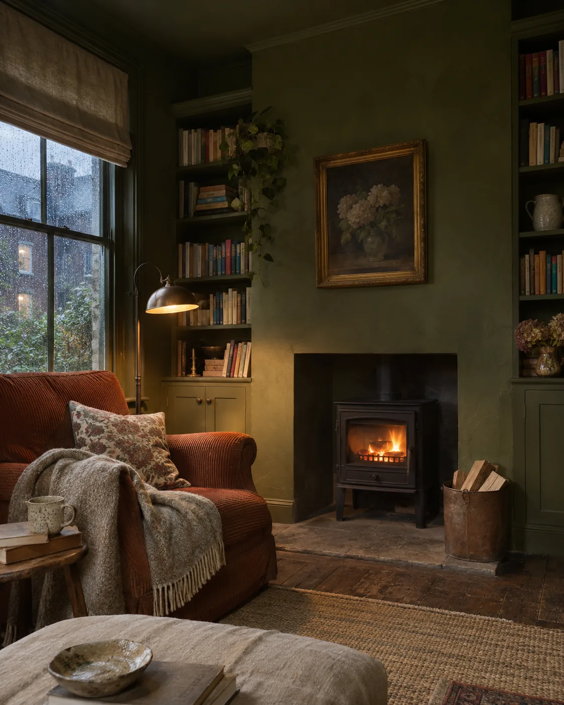
This sounds wrong and looks marvellous. Lilac stops olive feeling drab, olive stops lilac looking sugary. Try it in a bedroom or a bathroom. Farrow & Ball Treron No. 292, a dark grey-green, with Calluna No. 270, a soft lilac with a little black in it. For a cheaper lilac, Lick Purple 01, a pastel lilac with a hint of grey. Lilac walls with olive woodwork, or the reverse in a north-facing room where the lilac might go cold.
7. Pale yellow and grey-blue
Light and quiet, somewhere between a Swedish manor and a Georgian bedroom. It suits east- and south-facing rooms, and small rooms with low ceilings. Farrow & Ball Hay No. 37, a dusty yellow, with Light Blue No. 22, a silvery pale blue-grey. Alternative: Little Greene Pitcairn (61), a soft ochre tint, with Livid (263), a moody blue-green-grey. Yellow on the walls, blue on the woodwork and window shutters. Blue-and-white checked fabric, if you are feeling Scandinavian.
8. Teal and rust
Warm and cool at full strength together, which is why it works. Use it in a dining room, a downstairs loo or the back of a cupboard. Little Greene Grey Teal (226) with Ashes of Marigold (350), a blackened, rusty orange. Teal on the walls, rust on the ceiling, or rust velvet on the dining chairs and nothing else.
9. Soft black and warm white
The graphic one. It suits a kitchen, a bathroom or a new-build flat with good daylight; in a dim room it can become a cave. Farrow & Ball Railings No. 31, a soft black with blue in it, with Pointing No. 2003, a warm white. Cheaper: Crown Rebel with Crown Antique Cream. Mostly warm white, with black on window frames, a door, a kitchen island or a fireplace. Add brass or oak so it does not look like a gallery.
10. Pink and red, tonal
Two depths of one family. Sophisticated, warm and, in our view, forgiving in north light. Good in a dining room, a hall or a bedroom. Little Greene Dorchester Pink (213), a soft, warm pink, with Baked Cherry (14), a classic crimson. Pink on the walls above a dado and cherry below it, or pink walls with cherry doors and skirting.
Where we would start
If you are unsure, start with sage and terracotta, or green and pink. Both suit the soft, grey British daylight, both look good under lamps, and neither tires quickly. Save soft black and white for the room with the best light.
This weekend, put two samples beside the largest thing you are keeping, whether that is a sofa, a rug or the kitchen units. Move them around the room and look again after dark before you buy the full tins.
Sources
- Farrow & Ball: Bancha No. 298
- Farrow & Ball: Setting Plaster No. 231
- Lick: Green 02
- Lick: Pink 08
- Little Greene: Hicks' Blue (208)
- Little Greene: Yellow-Pink (46)
- Lick: Blue 07
- Lick: Yellow 07
- Edward Bulmer: Chocolate
- Edward Bulmer: Sky Blue
- Little Greene: Bronze Red (15)
- Little Greene: Stone-Pale-Warm (34)
- Dulux Heritage: Pugin Red
- Dulux Heritage: DH Stone
- Dulux Heritage: Sage Green
- Dulux Heritage: Red Ochre
- Edward Bulmer: Celadon
- Edward Bulmer: Brick
- Farrow & Ball: Treron No. 292
- Farrow & Ball: Calluna No. 270
- Lick: Purple 01
- Farrow & Ball: Hay No. 37
- Farrow & Ball: Light Blue No. 22
- Little Greene: Pitcairn (61)
- Little Greene: Livid (263)
- Little Greene: Grey Teal (226)
- Little Greene: Ashes of Marigold (350)
- Farrow & Ball: Railings No. 31
- Farrow & Ball: Pointing No. 2003
- Wickes: Crown Matt Emulsion, Rebel, 2.5L
- Wickes: Crown Matt Emulsion, Antique Cream, 2.5L
- Little Greene: Dorchester Pink (213)
- Little Greene: Baked Cherry (14)


